Savage Lovecast
A couple disagree about whether to have kids. A woman discovers her boyfriend has an STI. A pastor who likes watching pornography is scared he’ll get caught. These people need advice. So what do they do? They call Dan Savage.
Dan Savage doesn’t judge lifestyles, preferences or sexual quirks – he only judges bad decisions. His podcast, Savage Lovecast, has over 200,000 listeners weekly and is syndicated throughout the country. His column, Savage Love, is published in about 50 newspapers nationwide. For those who don’t know him, know this: Savage’s work has de-stigmatized modern conversations about sex, gender, and identity.
WebsiteteamSubstantial — Seattle, WA
DESIGN
Brit Zerbo, Lead Designer
DEVELOPMENT
Cassie Koomijin, Lead Developer
Matt Findley, Senior Developer
CLIENT ENGAGEMENT
Emily Griffin, Engagement Manager

ServicesBranding
Web App Dev & Design
Illustration
Motion

Year2017
The Challenge
Index Newspapers, LLC (The Stranger and The Portland Mercury) has been a long time client (and neighbor!) of Substantial. We have partnered with them on a variety of web apps and iOS apps over the past few years. They approached us to redesign their very popular Savage Lovecast web app with a heavy focus on templatizing the layout as they wanted to bridge themselves into the podcast platform market.
Our Focus
Modernize, marry and align the content and brand together
Improve UX and information hierarchy to increase engagement
Create content that is more discoverable and offering the user choice in how they want to engage
Improve SEO and accessibility
Design towards templatization to have future podcasts use the same site structure
Update the code base to the latest and greatest versions
Implement a new payment provider while also seamlessly switching over the current subscribers
Rebranding
I started off the project with my typical process of deep diving to understanding the goals and long term vision of the company/project, the audience, who their competitors are and who are the people/companies that we could look to for inspiration.
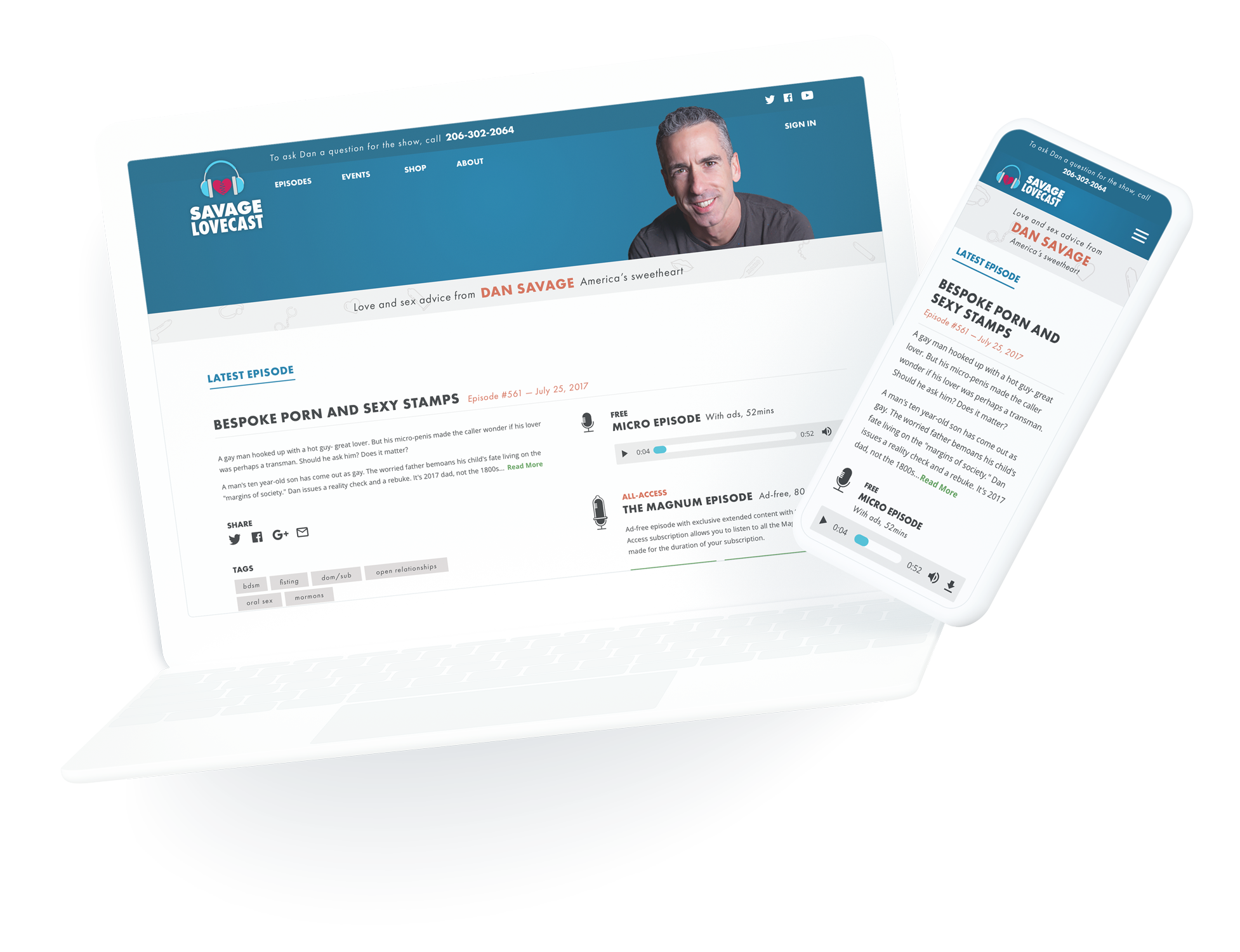
Dan Savage is known for his cheeky (and sometimes profane) sense of humor. One of the key differentiators of the Savage Lovecast is that each episode is released in two versions, micro, which is free, and magnum, which is longer and ad-free. During this beginning phase of UX research and strategy I had this ah-ha moment that we needed to brand the two subscriptions. We needed to give the users a fun and immediate understanding that the two are different while also making Magnum unique, an idea supported by the competitive analysis.
I decided to go out on a limb and quickly test a concept I was thinking about that had originally stemmed from a joke within the team. Because of this quick animation and a decision to set my fear aside of potentially crossing boundaries, the branding of Micro and Magnum became the foundational pieces that set the tone for the rest of the web app.

Quotes from the rebranding meeting“What if it was more of a vibrator than a condom?”
“Could we add an electric wire?”
“Electric wire?! How old are you?!”
“Maybe it should be a butt plug! …Everyone has a butt.”
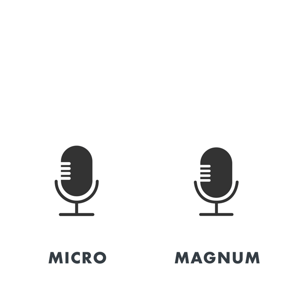
Somewhere amongst these verbal gold nuggets animating the Magnum icon was mentioned and my eyes LIT UP, with my creative flood gates opened up. There was no stopping me.
The Stranger team was beyond thrilled. Even Dan, himself, was ecstatic with how the Lovecast branding was taking shape. This was the start of a very deep spiral into creating a wide set of icons and illustrations that complimented the Micro / Magnum branding and added a NSFW cheekiness to the site.

Web App Redesign
As part of general housekeeping, we upgraded the technical underpinnings of the app to the “latest and greatest.” We also changed payment providers. With the UI redesign I dove head first into understanding the competition, the app market, content strategy and SEO best practices, which paved the way to presenting a list of features, both in scope and out of scope.

Original Homepage Design
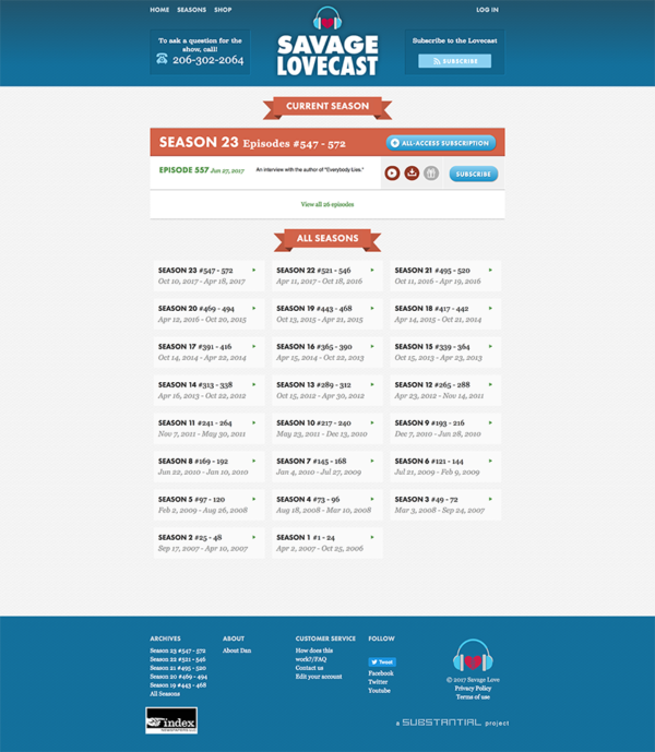
Original All Episodes Design
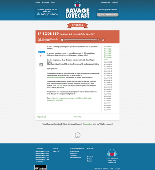
Original Episode Detail Design
We narrowed down the feature set to what could be completed in this phase of work and created epics. And thus started the journey of me having the most shocking public facing computer screen Substantial has ever seen.
We took an agile and systematic approach vs pixel perfect. Which translated to creating robust style guides and designing key screens vs designing every screen in every instance of the app.
I explored a variety of design directions. Playing around with layouts that would ultimately become the final redesign of the webapp. I started with the homepage and began color blocking the areas where specific content could live. This led to multiple layout versions and evolved to the final design. The resulting looking to the playful, custom animations, iconography, and copy to bring a new life to the web experience, which better surfaces recent and archived episodes, and presents promotional opportunities for related events.


Final Designs & Illustrations
The entire internal team had a lot of passion and pride for the project. We found ourselves regularly giggling at the designs and illustrations that were created, which kept the overall morale high and I feel like that’s all anyone could really ask for within a project. Sex toys and innuendoes.


Poster design for Substantial’s office
As a fun way to remember our past projects the design team created posters for a few of our favorite projects. We printed, framed, and hung them on a dedicated wall to showcase our work. It was so much fun to revisit this project and create something new.