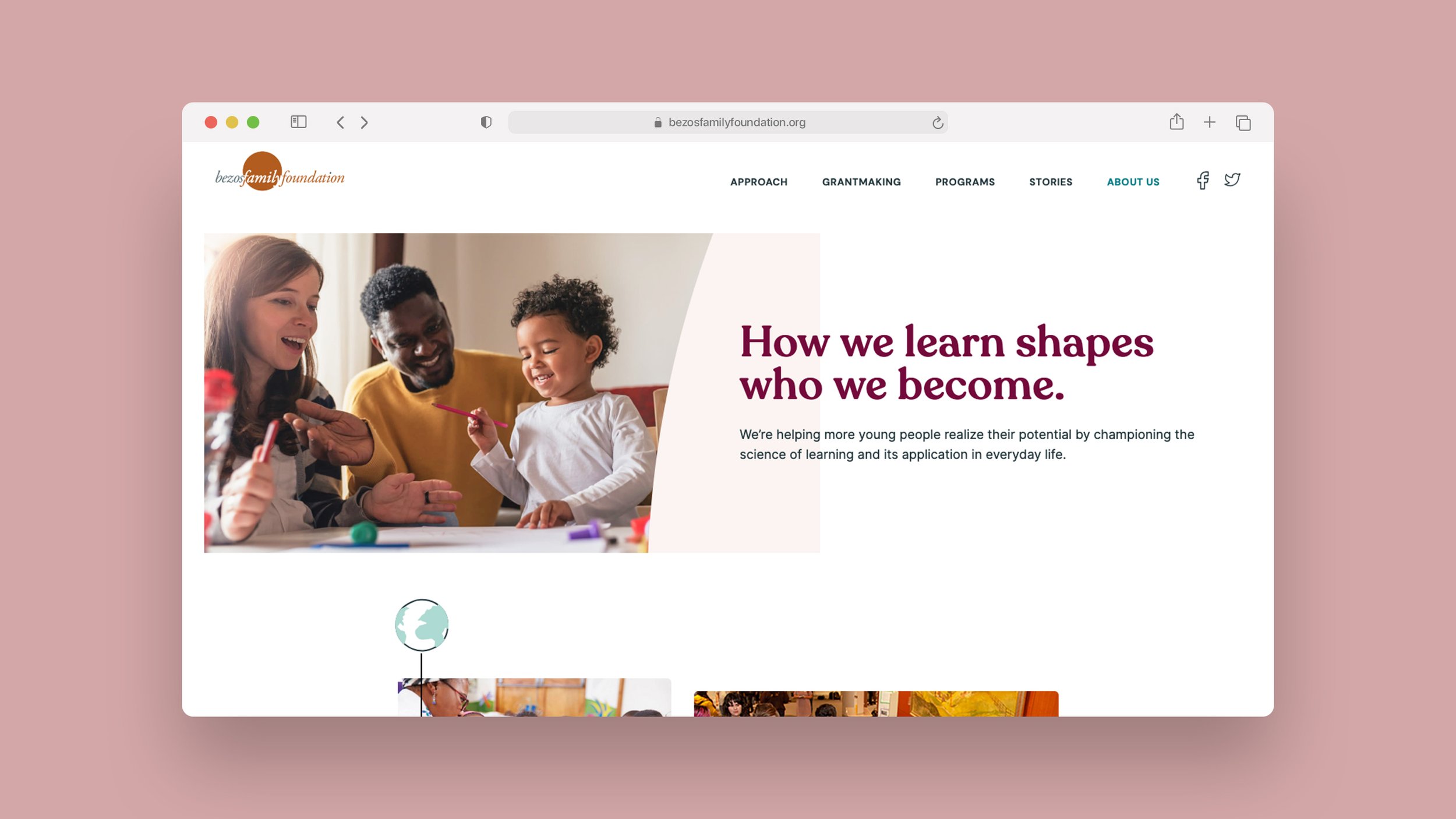
Bezos Family Foundation
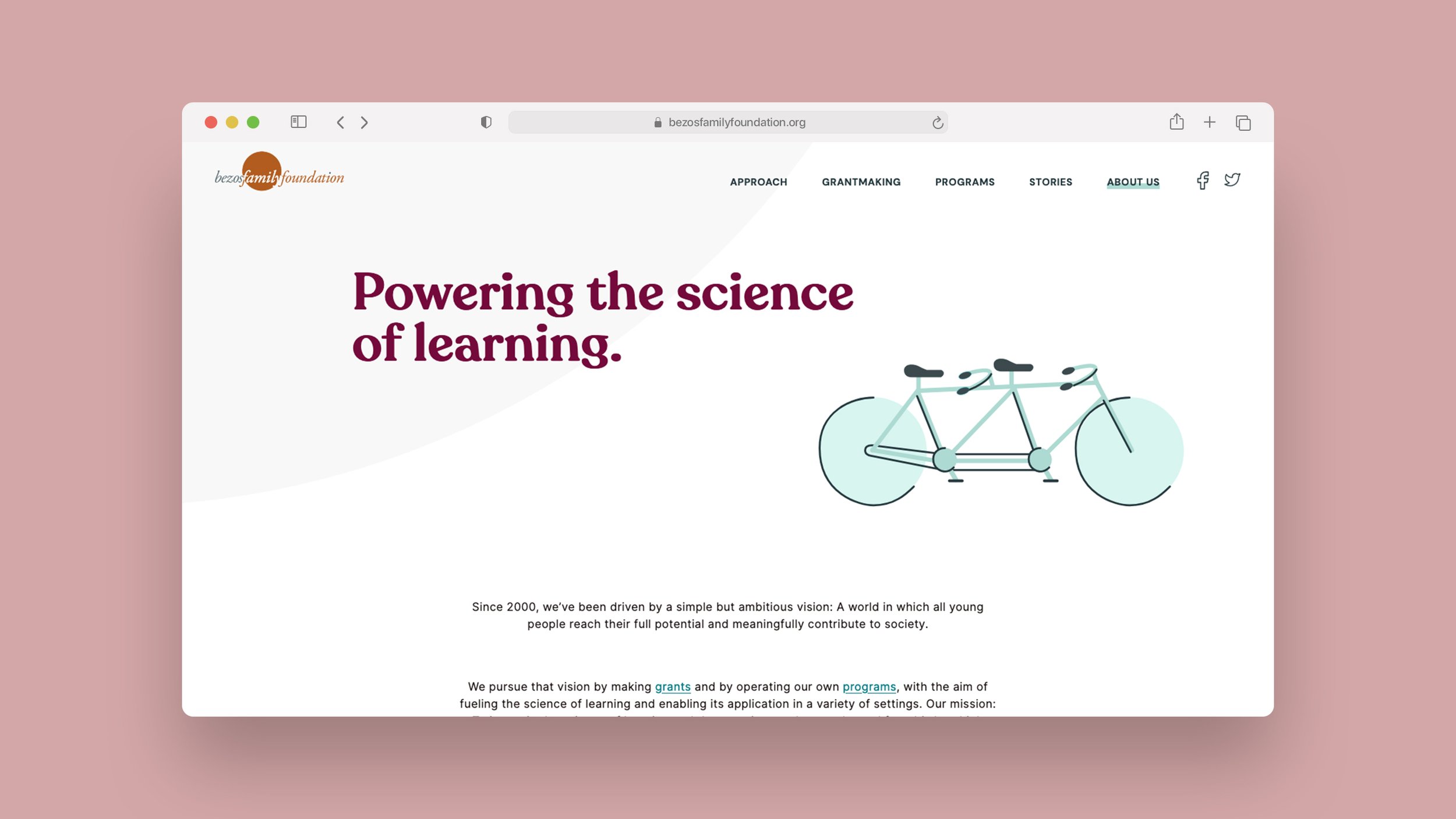
A world in which all young people reach their full potential and meaningfully contribute to society.
The Bezos Family Foundation pursues that vision by making grants and by operating our own programs, with the aim of fueling the science of learning and enabling its application in a variety of settings. Our mission: To invest in the science of learning and the experiences that youth need from birth to high school to pursue their own path for success.
WebsiteteamSubstantial — Seattle, WA
DESIGN
Brit Zerbo, Lead Designer (2020)
Christine Johnson, Lead Designer (2021)
DEVELOPMENT
Melanie Vanderlugt, Lead Developer
Miles Starkenburg, Senior Developer
CLIENT ENGAGEMENT
Magda Isack, Engagement Manager
ServicesWebsite Dev & Design
Illustration
Year2020-2021
The Challenge
The Bezos Family Foundation was a long running client of Substantial. We regularly did work for their various programs like Vroom and Students Rebuild. So much focus was always put on changing lives and overtime the foundation’s website became challenging to navigate as technology was advancing and the world of mobile-first was coming forward as a standard practice. They partnered with us to form a team and begin the journey of redesigning their website.
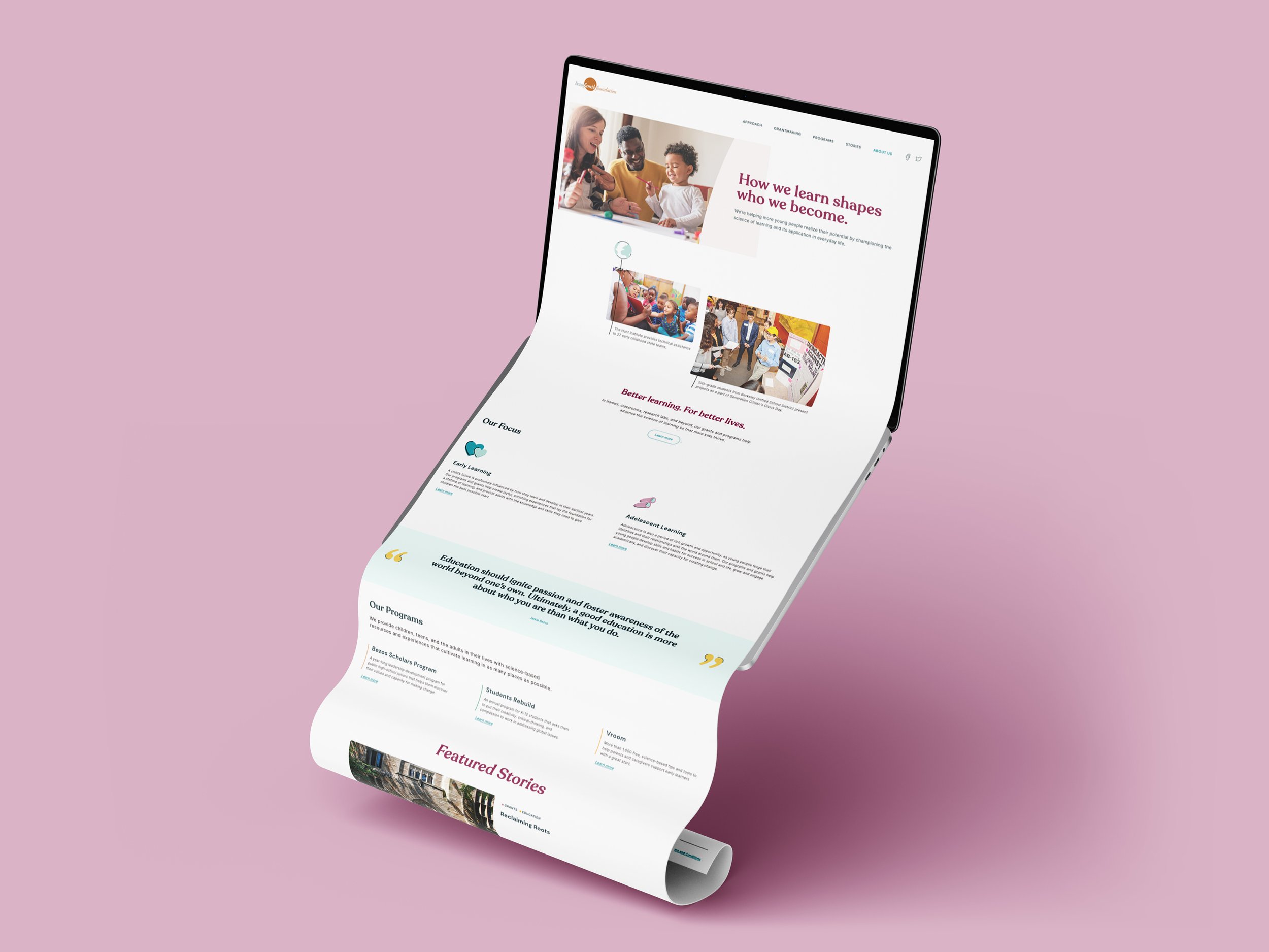
Our Focus
New, fresh, and updated look and feel
Responsive design with a strong focus on mobile and portable devices
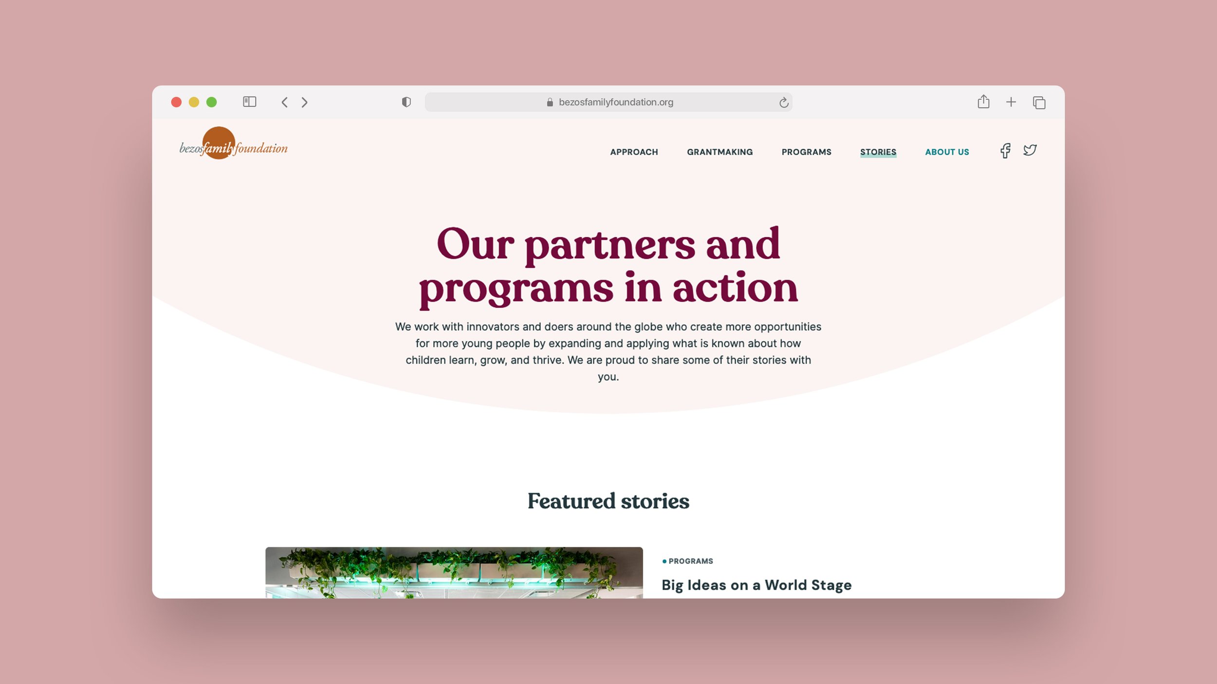
Storytelling and supporting designs about their approach and programs created and run by the foundation
Integrate a blog to showcase stories
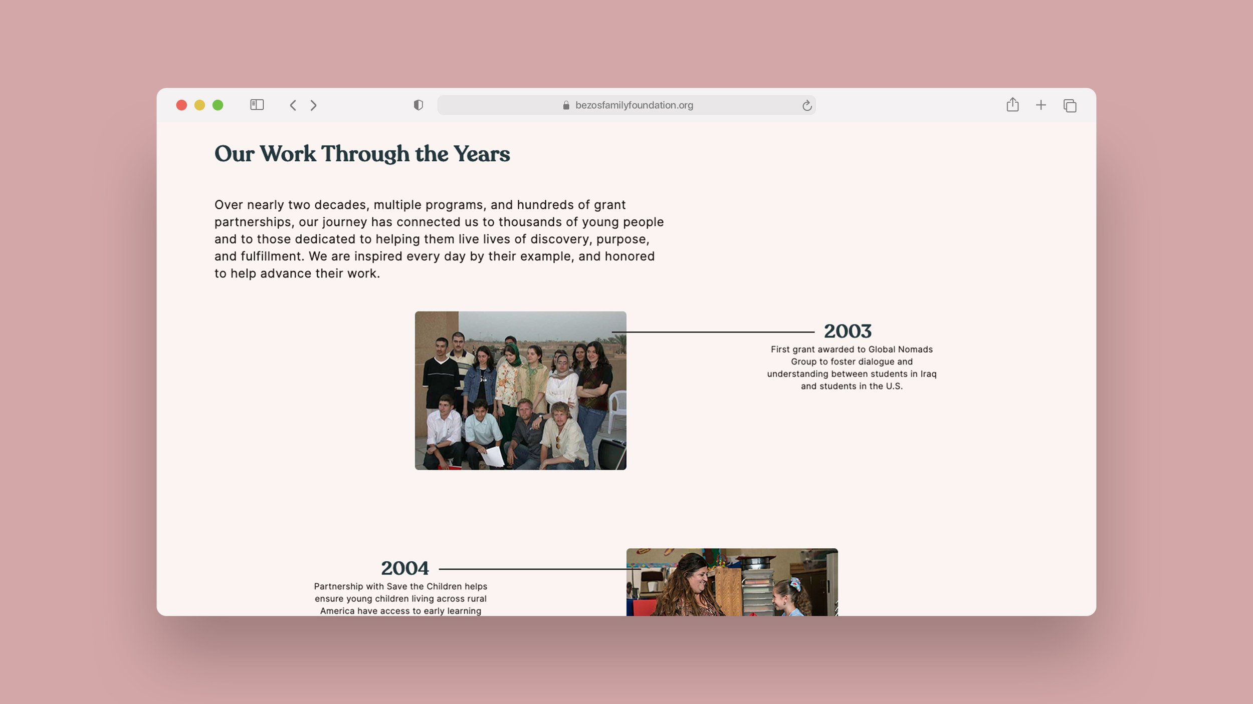
Visually appealing timeline of the history of the foundation
Showcase grants offered through an easily updatable list
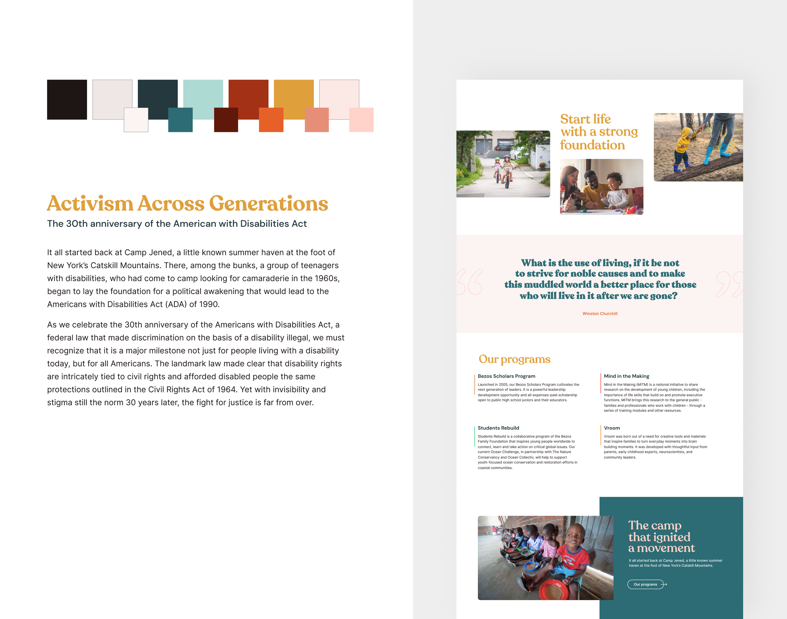
Brand Exploration
First things first → research! I deep dove into the Bezos Family Foundation’s competitors and did a quick audit of their brand and website experience. After gaining a broader understanding of how other foundations and non-profits are positioning themselves I explored various graphic, color, and type treatments which lead into multiple design reviews where we narrowed down the look and feel.
Below are the moodboards I pitched to the BFF team. They gave insightful and direct feedback which helped me further push concepts and explore new ones.
Moodboard Concepts

Moodboard 1 →

Moodboard 2 →

Moodboard 3 →

Moodboard 4 →

Moodboard 5 →

Moodboard 6 →

Moodboard 7 →

🎉 Moodboard 8 🎉
Four rounds of design reviews and eight moodboard concepts later…
We decided that Concept #8 was the strongest approach and I began to define the details that would soon become the foundation of their brand and larger visual system to support development.
Logo Exploration
As I began to refine the look and feel of the website the original logo was feeling more and more out of place. In our next meeting with the BFF team I pitched the idea of modernizing their existing logo to match the tone of the new website design. They were hesitant at first, but curious to what it could become. They gave me the green light to do a quick sprint and see what I could come up with.
Feeling their initial hesitation and wanting to respect the familial nostalgia that is attached to the original logo I didn’t feel like it was appropriate to present anything that strayed too far away from their original design (plus I didn’t have the time to dive deeper). I chose to view this more as a “face lift” vs. an overarching rebrand.
Original logoProposed redesignUpdated “face lift” approach using the circle in a different way and leveraging a different weight of the main display typeface that is used on the website.
Original Website Design

Original Website — Homepage

Original Website — Programs

Original Website — About Us
Design System
Design System
Logo & Colors

Typography
Icons & Illustrations
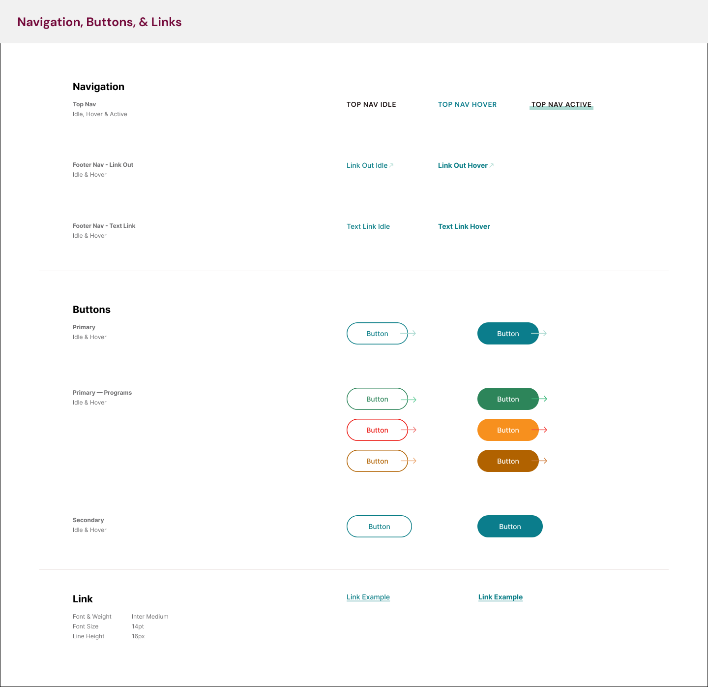
Navigation, Buttons & Links

Top Nav, Sub Nav & Footer

Quotes & Call Outs

Cards

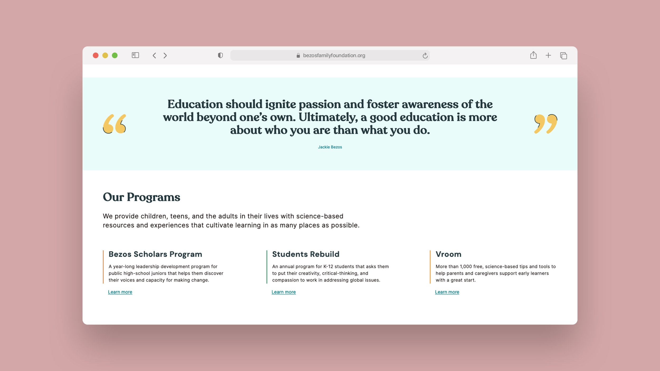
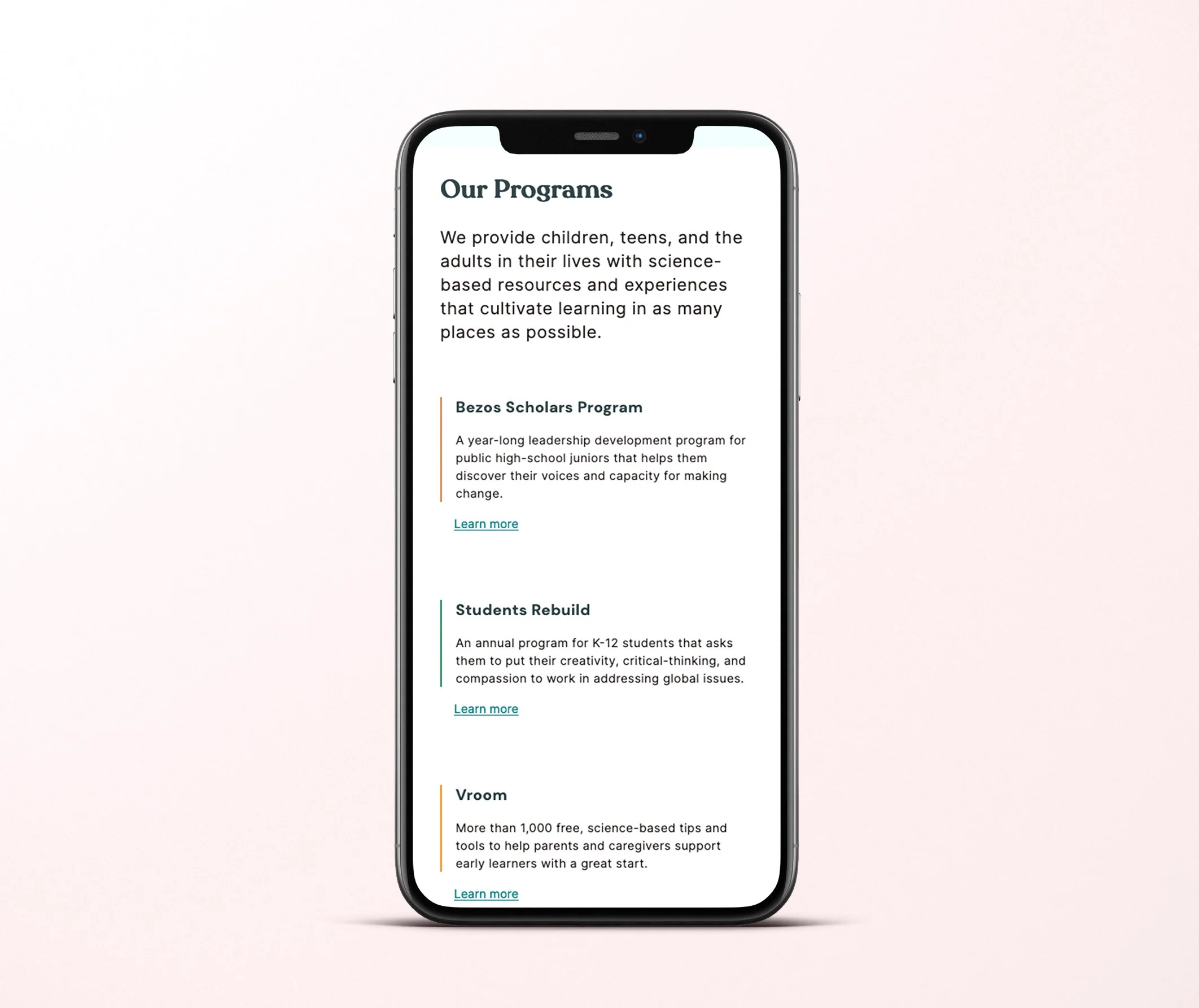
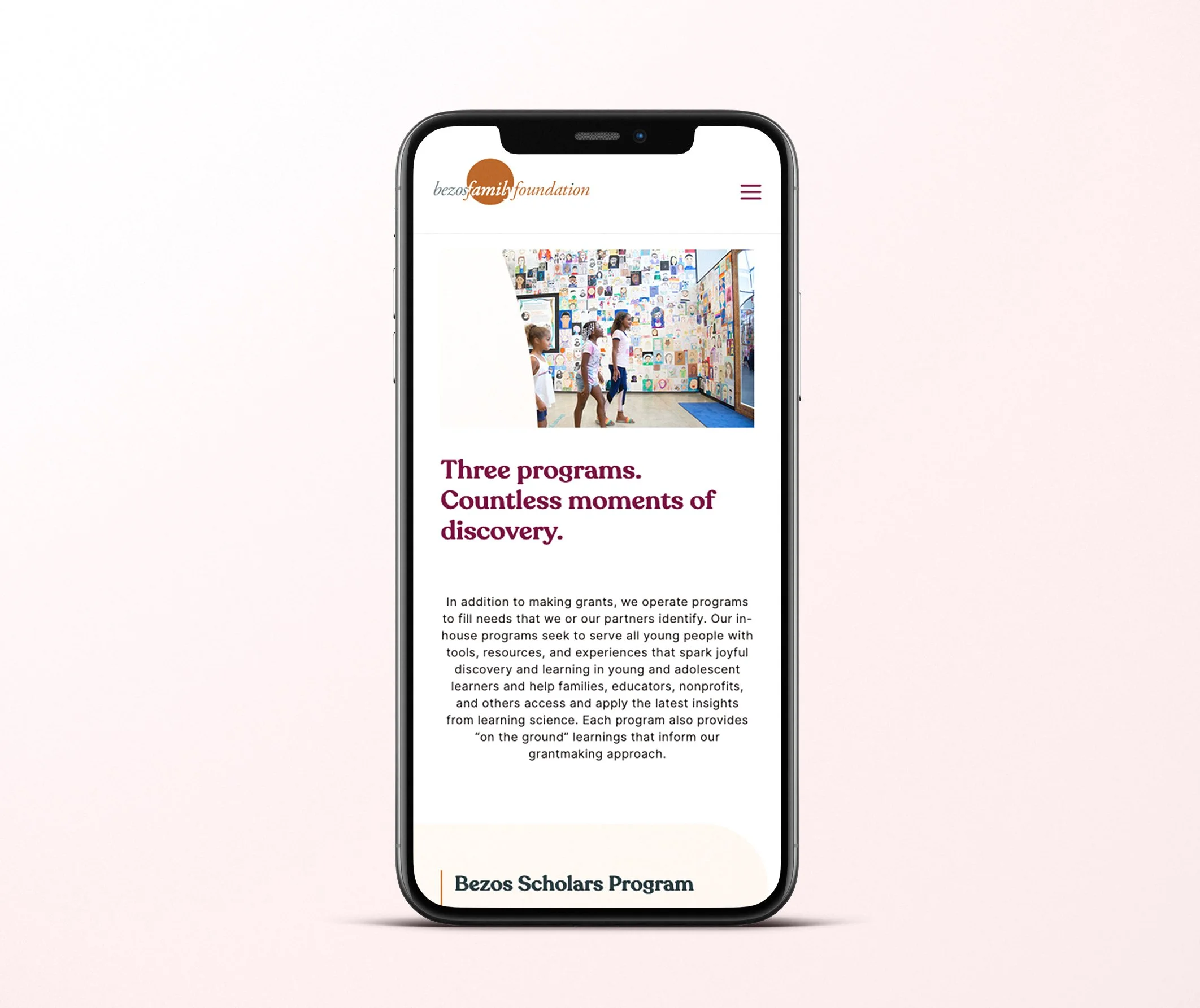
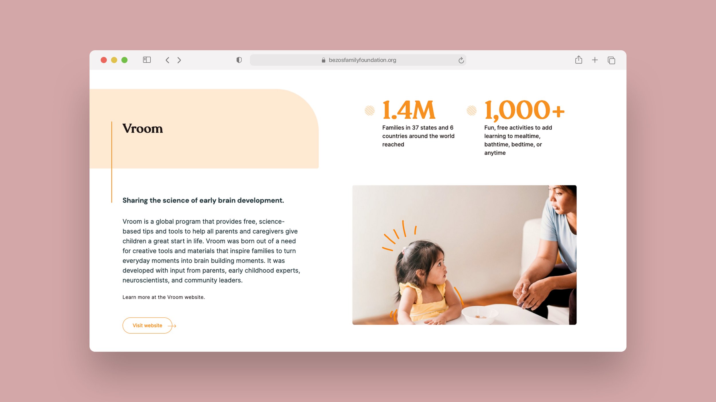
Programs
Final Designs & Components